ORNAC Logo Branding Design & Print
Operating Room Nurses Association of Canada
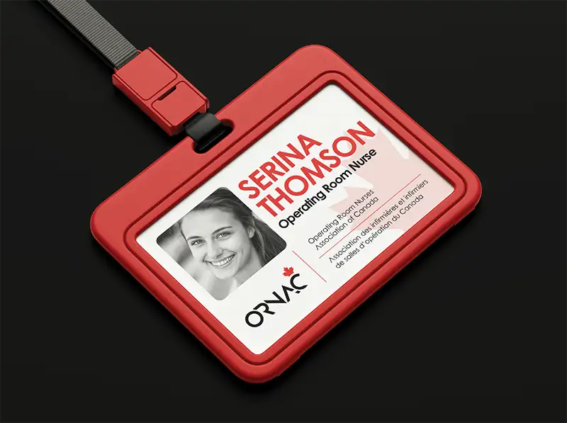
ORNAC (Operating Room Nurses Association of Canada) logo and brand identity were designed to reflect professionalism, national pride, and the compassionate strength of Canada’s nursing community.
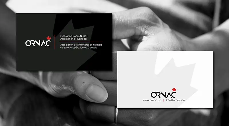
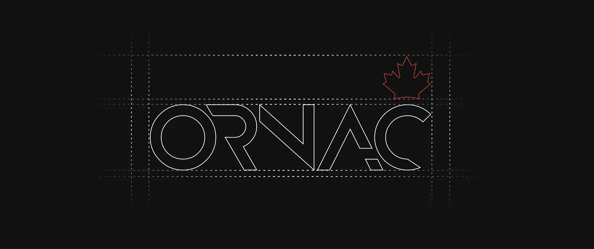
The maple leaf, inspired by the Canadian flag, is subtly integrated into the wordmark to symbolize unity and national identity. Its placement above the “C” represents leadership and care qualities that define operating room nurses across the country.
The custom geometric typography conveys modernity, precision, and trust, values essential in healthcare environments. The interplay of clean lines and open forms reflects both technical expertise and human connection.
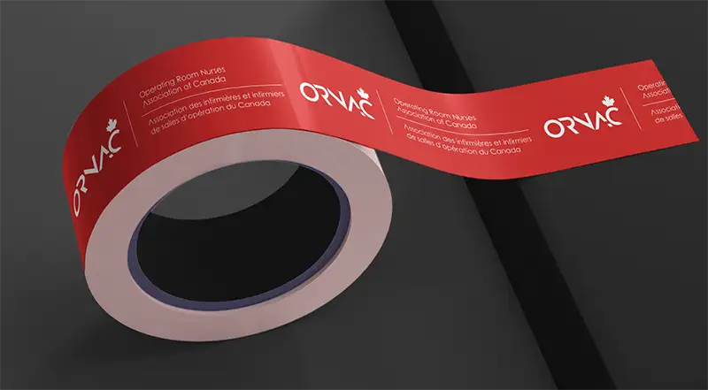
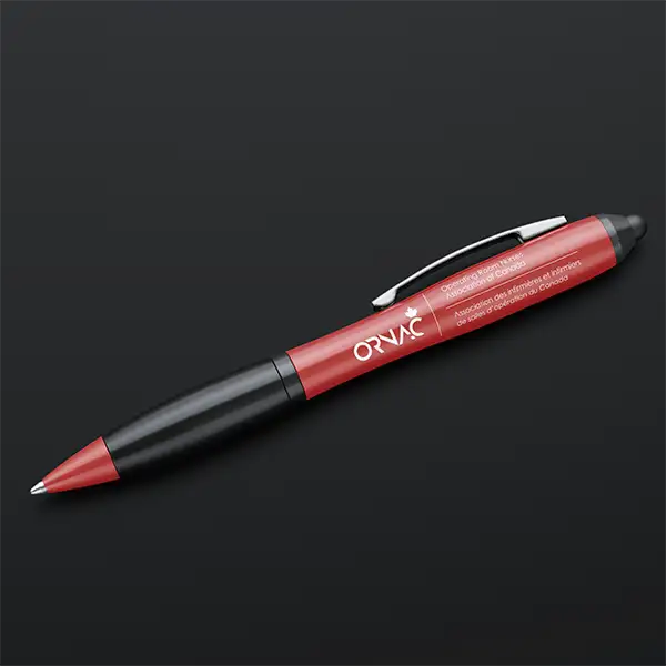
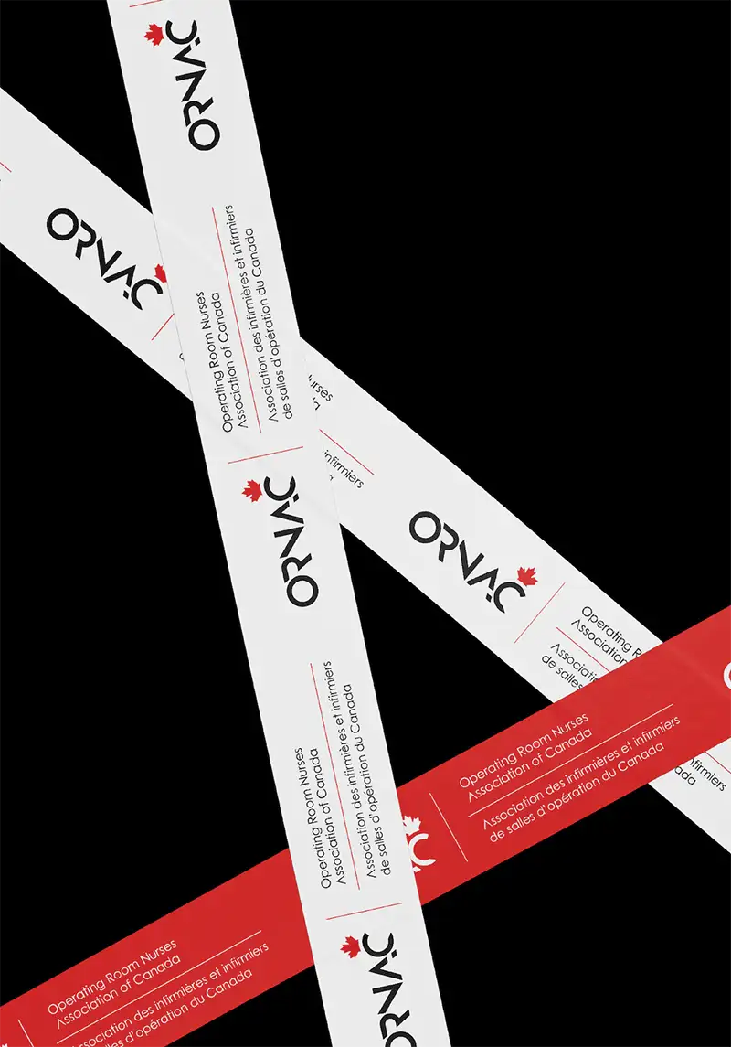
The color palette is rooted in Canada’s visual identity, featuring a deep, muted ORNAC Red complemented by black and white for clarity and professionalism.

Key Highlights of the Branding
Core Values Reflected Canadian Identity:
The maple leaf, drawn from the national flag, symbolizes unity, pride, and professionalism across Canada’s healthcare community.
Modern Wordmark
A custom, geometric typeface communicates precision, confidence, and modernity, reflecting the technical expertise of operating room nurses.
Balanced Color Palette
Primary Colors: ORNAC Red, Black, and White create a bold, timeless identity.
Professional & Approachable Tone
Clean lines, structured layout, and balanced typography create a sense of trust, clarity, and care which are key values in healthcare design.
Bilingual Representation
English and French text are treated equally, reflecting inclusivity and Canada’s dual-language culture.
Versatility
The logo and colors adapt seamlessly across print, digital, and professional materials, ensuring strong brand consistency.


Logo
Strengths: The bold geometric typography feels modern and confident and a good fit for a professional health organization.
The integration of the maple leaf subtly reinforces the Canadian identity without overpowering the logo. The clean black-and-white contrast ensures great legibility across print and digital formats.
The stylized “A” in “ORNAC” is visually slightly abstract which makes it distinctive and unique for brand recognition.

Color Palette
Primary Colors (Red, White, Black):
Classic, authoritative, and distinctly Canadian.
The chosen ORNAC Red is warmer and more muted than a typical bright red, this feels grounded, trustworthy, and less aggressive.
Secondary Colors (Blue & Grey): The soft teal-blue adds a sense of calm and balance, aligning well with the healthcare field. It brings warmth, stability, and a contemporary feel to the brand.
The charcoal grey adds depth and versatility in layouts and printed materials. Together, these secondary tones help modernize and soften the strong red-black contrast as well as warmth, stability, and a contemporary feel to the brand.
Overall, this identity positions ORNAC as a confident, modern, and distinctly Canadian organization, one that honors tradition while looking forward to the future of nursing.
The secondary tones, a calming blue and balanced grey, bring warmth, stability, and a contemporary feel to the brand.


Other Jobs


Ready to Grow Your Brand?
For your next Design | Marketing Project
Let’s turn your ideas into something bold, beautiful, and beyond. We love meeting new brands, chatting about ideas, and finding creative ways to make your business stand out.
