Dr. Catherine Newry: Holistic Visual Identity
Cultivating calm and confidence through organic form and structured design
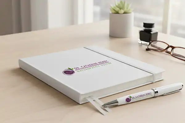
Naturopathic Doctor logo features an elegant and modern abstract rose symbol, designed using fluid, swirling lines that create a sense of natural movement and holistic energy. The spiral form represents growth, healing, and the interconnected nature of wellness. Its layered shades of purple convey calmness, wisdom, and therapeutic balance, while the green leaf elements introduce a fresh, natural touch that reflects vitality and plant-based healing.
Overall, the logo combines softness with structure, creating a visual identity that feels both scientific and nurturing. It communicates a message of natural health, holistic medicine, and an individualized approach to patient wellbeing.

Key Highlights of the Branding
Holistic Symbolism
The logo combines an abstract rose swirl representing growth and energy with fresh leaf elements. This fluid yet structured design perfectly visualizes the merger of natural, plant-based healing with clinical expertise.
Therapeutic Color Palette
A harmonious blend of layered purples conveys wisdom, calmness, and premium care. These are balanced by organic greens that reinforce vitality and the practice’s deep connection to nature-inspired wellness.
Refined Typography
The primary typeface, PENNA, provides an elegant and approachable modern aesthetic. It is supported by the geometric clarity of Futura Medium, ensuring the brand communicates both nurturing empathy and professional precision.
Versatile Design System
The clean, structured layout ensures adaptability across all digital and print environments. The distinct symbol can stand alone, maintaining a cohesive and trustworthy identity at every patient touchpoint.

Core Values
The brand is grounded in a philosophy of holistic healing, combining nature-inspired remedies with evidence-based care to support the body’s innate ability to restore balance. Compassion,
empathy, and integrity shape every patient interaction, ensuring a warm and trustworthy experience and personal growth. Its calming palette of purples and a green reinforces themes of wisdom, balance, and nature-based wellness, while the clean, modern typography conveys professionalism and clarity. Together, the organic symbol, structured layout, and harmonious colors create a unique and memorable identity that blends clinical expertise with a warm, holistic approach to naturopathic care.
The practice helps individuals understand their health and take confident steps toward long-term wellness. Above all, the brand is committed to personalized care and achieving harmony across mind, body, and spirit.

Versatility
Versatility in Dr. Catherine Newry’s branding refers to how easily the visual identity adapts across different applications, formats, and environments while still maintaining a consistent and professional appearance.
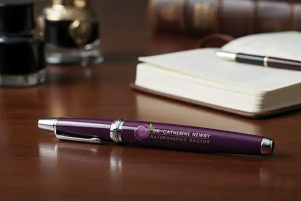
The logo’s clean structure, balanced colors, and modern typography allow it to work effectively in both digital and print mediums—such as websites, social media, business cards, signage, packaging, and educational materials.
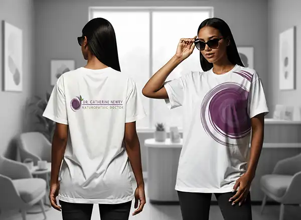
The abstract symbol can also be used on its own as a simplified mark when needed, providing flexibility without losing recognizability.
Additionally, the color palette and typefaces remain clear and readable at various sizes, ensuring the brand maintains its calm, trustworthy, and holistic tone in every context.

For Dr. Catherine Newry, brand Consistency builds recognition, trust, and professionalism by presenting a unified identity that patients can immediately identify and rely on. When the brand appears cohesive everywhere, it reinforces credibility, strengthens the emotional connection with patients, and supports a clear, confident presence within the wellness and healthcare space. This adaptability ensures the brand remains strong and coherent regardless of where or how it is used.
The abstract rose-shaped swirl represents natural healing, growth, and the flow of holistic energy.
Paired with a green leaf, it clearly communicates a connection to nature and plant-based wellness. It makes the symbol unique, less generic than typical medical leaves or caduceus icons.
The rose-like form gives the logo a personal and warm feel, which is important in a healing profession The harmonious blend of purples and greens evokes calmness, balance, and natural health. Purple adds a
sense of wisdom and therapeutic care, while green reinforces vitality and the naturopathic philosophy.

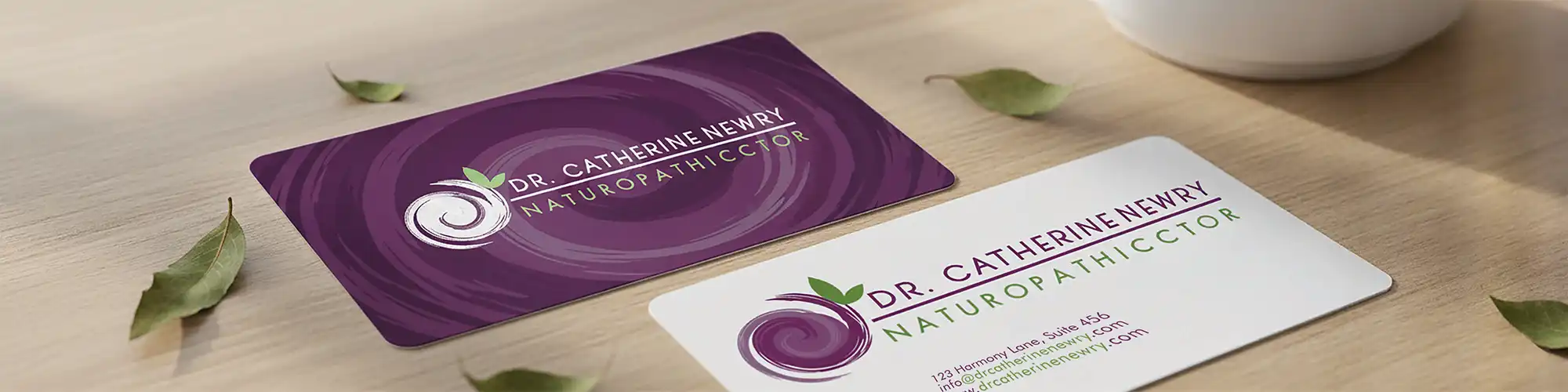
The structured layout—symbol on the left, name centered, and specialty highlighted beneath—ensures immediate recognition of the
doctor’s name and credentials.
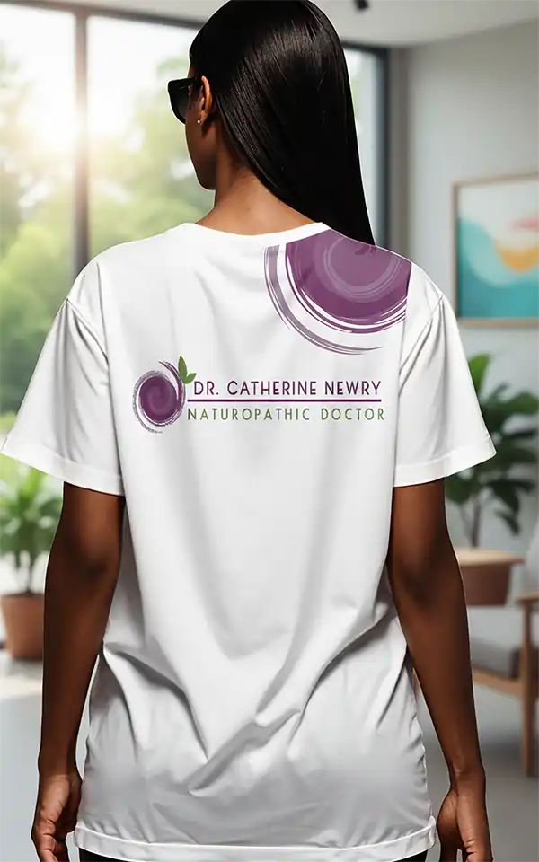
The left icon and right text create a stable, professional horizontal layout that works well for websites, signage, business cards, and letterheads.
The organic, flowing symbol stands apart from traditional medical logos, giving the brand a distinctive and recognizable identity that reflects holistic, personalized care.
The design merges clinical professionalism with natural elements, perfectly reflecting the integrative nature of naturopathic medicine.
The structured layout, symbol on the left, name centered, and specialty highlighted beneath, ensures immediate recognition of the doctor’s name and credentials.

Color Pallete
Primary Colors
Purple (#6d245d): conveys wisdom, symbolizes healing, holistic medicine, calm, trust and a blend of science with holistic practice. It also feels premium.
Green: Represents nature, herbal medicine, renewal, and balance.
Secondary Colors
Lighter purple tones in the swirl add depth and movement while white space creates a clean, clinical feel.
Green: symbolizes nature, health, balance, herbal medicine. A perfect pairing with naturopathy.
The combination feels harmonious, earthy, and holistic.
Overall, color Harmonious, natural, consistent with naturopathic branding evokes modernity, calm and trustworthy, which is ideal for health-focused brands.

Typography
The primary typeface for Dr. Catherine Newry’s branding is PENNA, a clean and refined sans-serif font known for its modern simplicity, elegant character and easy to read.
PENNA is known for its minimalist aesthetic, balanced proportions, and smooth letterforms that create a calm, approachable visual tone, perfectly aligning with the holistic and nurturing philosophy of naturopathic care. Its subtle geometric influence provides a contemporary, professional feel, while the generous spacing enhances clarity and readability across digital and print applications.
This typeface reinforces the brand’s commitment to trust, harmony, and modern wellness, offering a sophisticated foundation that enhances both digital and print communications. Using uppercase adds confidence and authority. It provides clarity, and approachability. The thin spacing and geometric feel support a clean and clinical impression.
The descriptor “Naturopathic Doctor” is set in Futura Medium, a timeless geometric sans-serif typeface known for its clarity, precision, and modern professionalism. Futura’s clean lines and balanced letterforms create a strong visual foundation that communicates reliability and expertise, an ideal complement to a medical and wellness-focused brand.
The medium weight adds presence without overpowering the primary name, providing a confident yet understated emphasis. Its geometric structure pairs harmoniously with the organic shapes of the logo, creating a visually pleasing contrast that balances science with nature.
Good spacing (tracking) creates a sense of modern, calm and clarity.


Other Jobs


Ready to Grow Your Brand?
For your next Design | Marketing Project
Let’s turn your ideas into something bold, beautiful, and beyond. We love meeting new brands, chatting about ideas, and finding creative ways to make your business stand out.
